
TEACH
TRAIN
BLESS
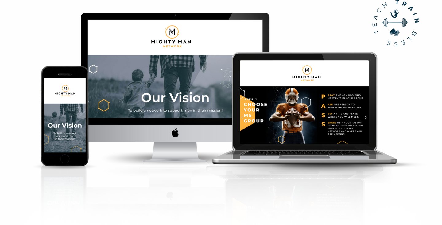
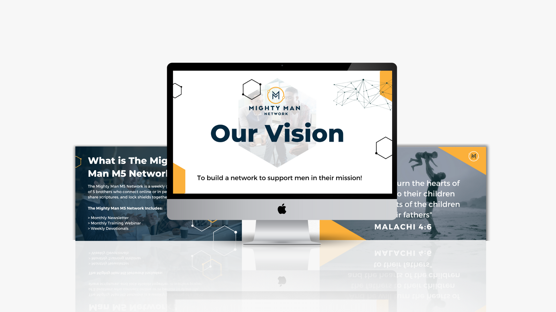
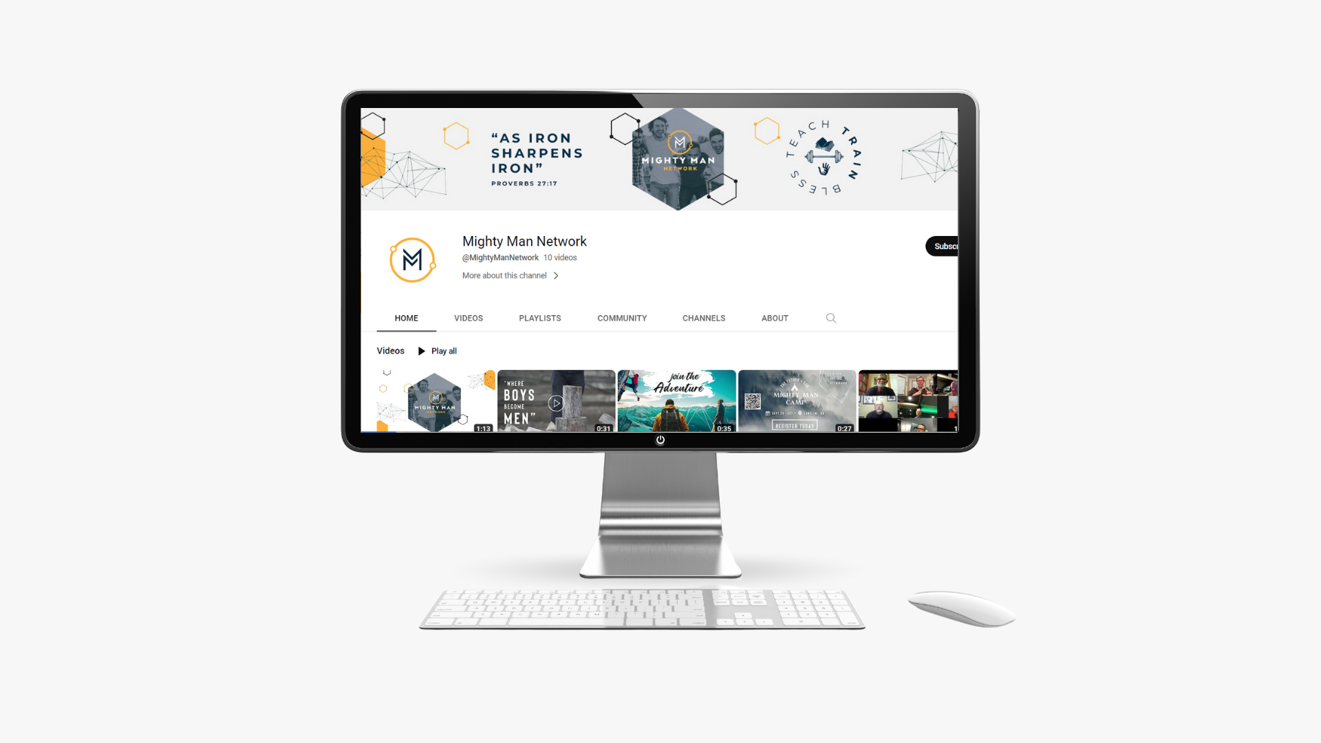
MIGHTY MAN NETWORK
ASSETS INCLUDED
> WEB PAGES DESIGN
> LOGO DESIGN
> SOCIAL MEDIA GRAPHICS
> PRINT COLLATERAL
> APPAREL DESIGN
> NEWSLETTER DESIGN
> PRESENTATION DESIGN
> VIDEO PROMOTIONS
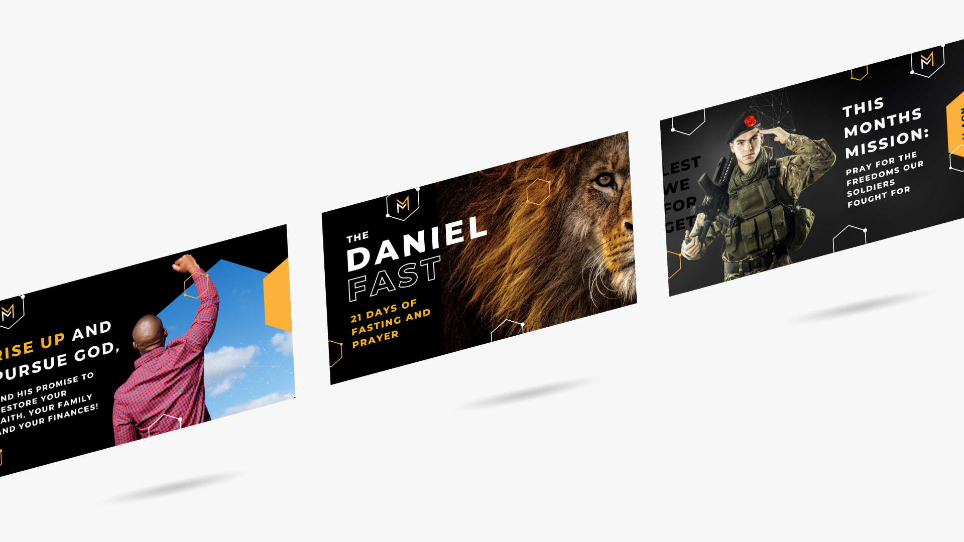
The Mighty Man Network was created to equip men across Canada to help them teach, train, and bless their families. They do this by connecting men who share life, encourage one another and pray for each other.
It is one of the initiatives of the Family Dream Institute. The rationale behind the logo was to show an abstract of two mens arms around each other, and a double M. There is then a circular circuit around to show the network part


ASSETS INCLUDED
> LOGO DESIGN
> SOCIAL MEDIA GRAPHICS
> PRESENTATION DESIGN
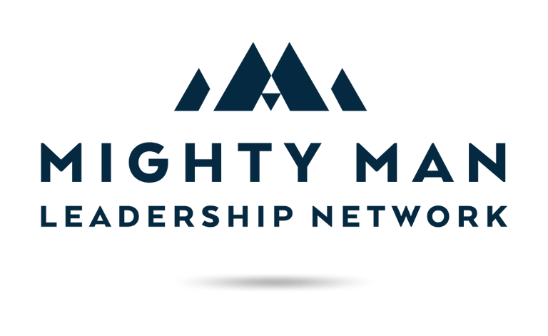
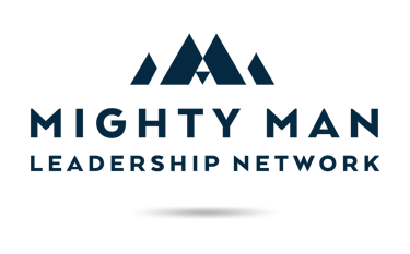
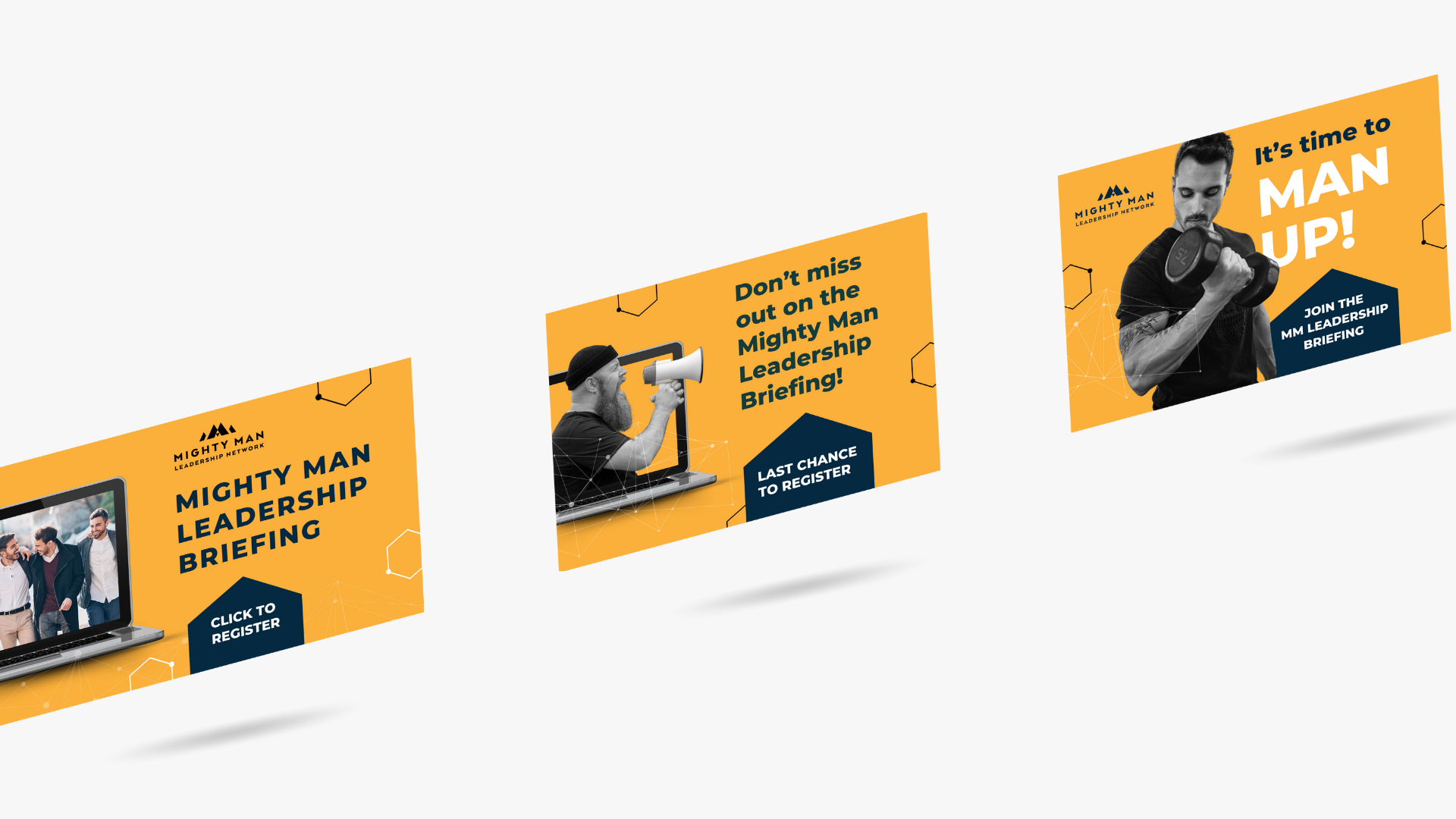
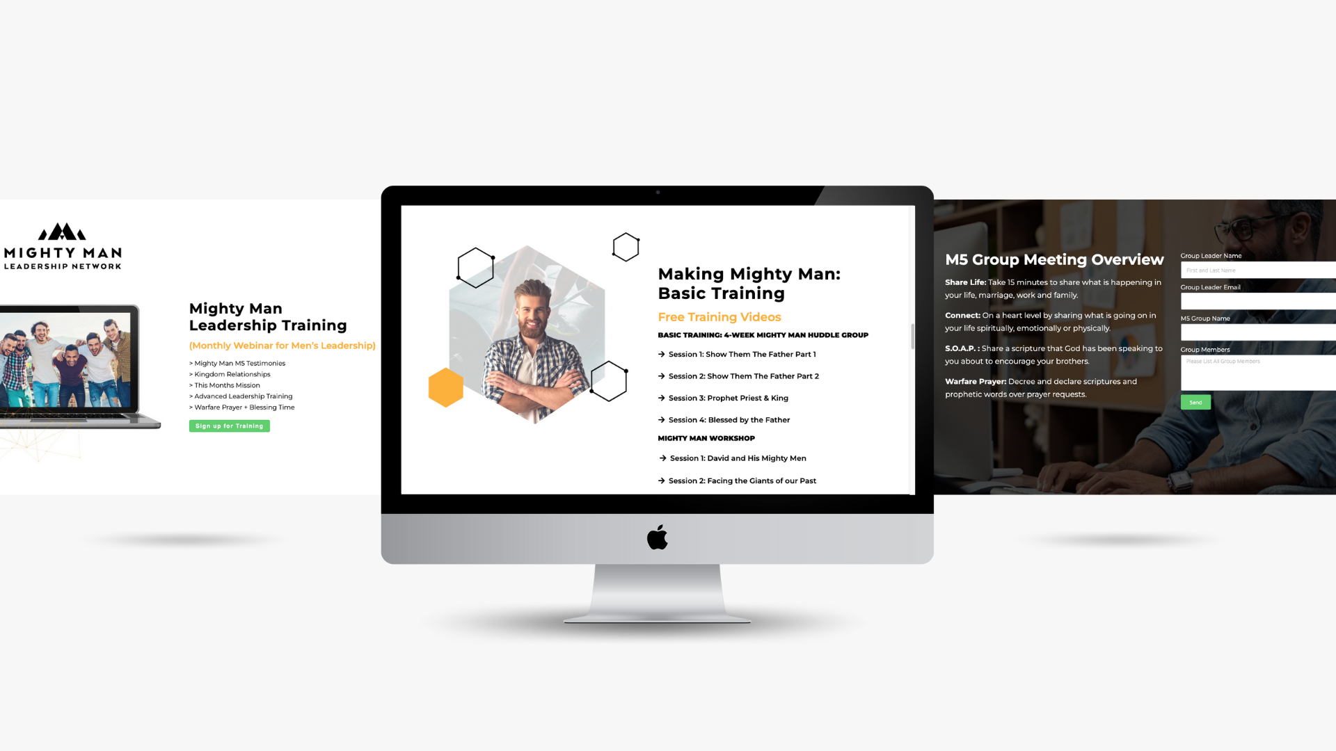
This is a sub brand of the Mighty Man Network, that is focused on equipping men to be leaders, They have a monthly webinar that is Canada wide that includes testimonies, teaching, and prayer. The logo is an abstract mountain to signify strength, power, and leadership.